top of page


Pippāl Regional Indian
Rooted In Connection
Pippāl is a gathering place that celebrates the richness and diversity of Indian culture and cuisine and melds traditional flavors with a modern touch. Our team developed the verbal and visual identity for the concept and brought the vision and experience to life through bespoke touchpoints that captured the vibrant culinary journey.
Agency Carbonate
Services Brand DNA, Verbal Identity, Visual Identity, Collateral Design
Team Johnna Quinn (CD), Mariel Lustig (Designer), Rachel Green (Brand Strategist)
Role Lead Designer
Photography Neetu Laddha

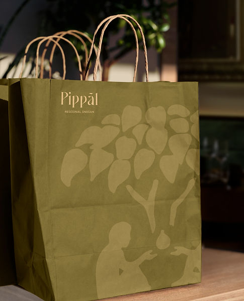

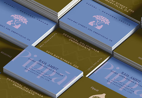

In India, one can experience variations in language and cuisine as often as every 10 miles. Found throughout all these many regions is the pipal (sacred fig) tree—the “tree of life”—where people come together under its lush canopy to eat, share, and commune.


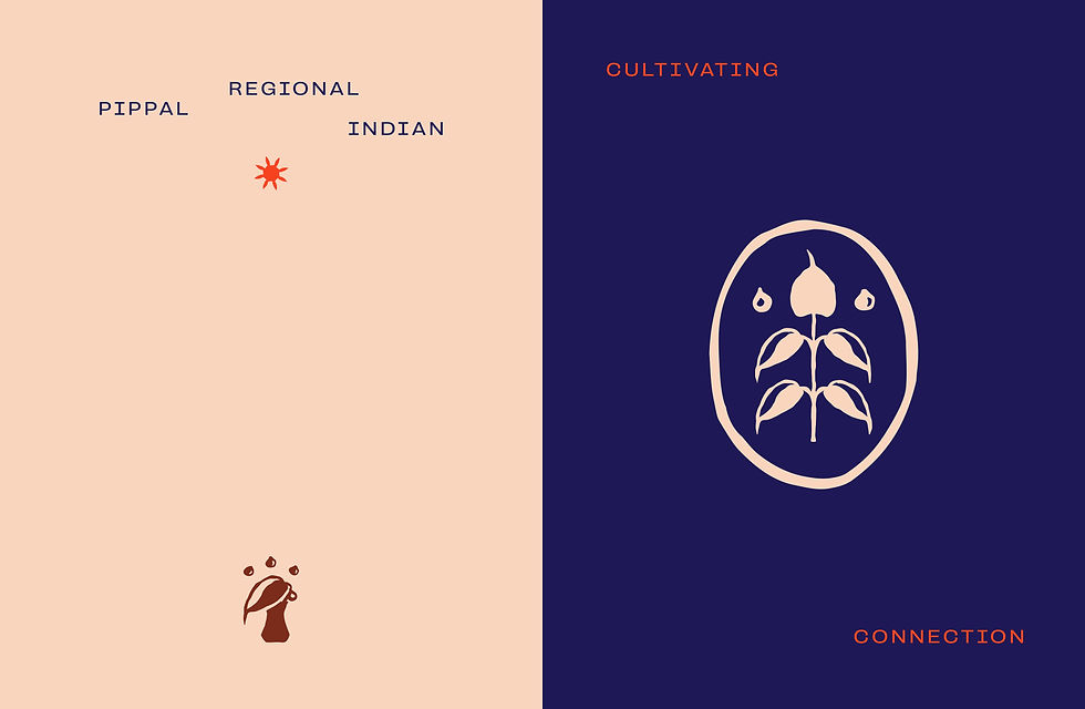
A lively color palette creates a dramatic impact across touchpoints in the sleek and modern interior, while custom patterns and illustrations echo unique architectural details.



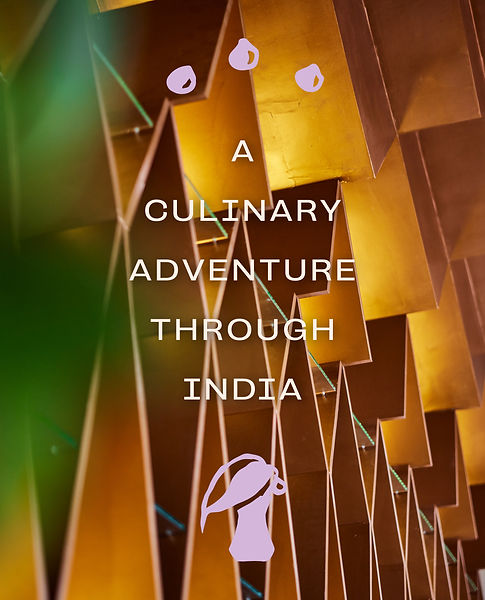
The visual identity system is centered on a custom wordmark that integrates the shape of a fig into its letterforms, and a system of hand-drawn icons depict the cherished experience.


bottom of page